
How to Test Paint Colors on Your Walls (and How Lighting Changes Everything)
- Jordan

- 4 days ago
- 11 min read


We've all been there—you're about to paint a room and you're excited to have picked out several paint color swatches from the store. You pick a few options that you think you like, line them up side by side on the wall, and pick one...only to find out that when you paint it on the wall, the color is almost unrecognizable from the swatch.
The swatches aren't necessarily wrong. What you're seeing is how light and surrounding colors affect other colors.
Why Paint Colors Look Different in Every Room
Lighting: The direction of light and type of light can dramatically change how we perceive a color. Natural light has the most variance, with morning light being bright and cool, while light towards the end of the day will be warmer. If your space has a lot of natural light through windows or doors, natural light will play a huge role in how your paint colors appear on the wall.
Something important to consider with natural light, is the direction that your room is facing. North-facing rooms cast cooler shadows, while south-facing rooms tend to receive warmer light.
Artificial lighting is more predictable, as the types of bulbs you have largely determine what type of warmth and intensity it is. Artificial lighting can be trickier in its own ways though—for example, a color swatch in a paint store will look drastically different in your own home. A store often has overhead fluorescent lights that are bright and cool. If you were to go home with the same swatch, the color may suddenly look muted or yellowed in comparison to what it looked like at the store.
Paint Finish: The paint finish you choose can play a small role in how colors look on your walls. Different paint finishes reflect light differently due to their microscopic makeup. Matte finishes absorb and diffuse light rather than reflecting it. On a microscopic level, matte paint has an irregular texture that causes it to scatter light, making surfaces oftentimes appear darker, flat, or muted in comparison to non-matte finishes.
On the other hand, glossy or satin finishes reflect more light, which can make colors appear brighter or more intense.
Undertones & Surrounding Colors: Did you know that nearby colors can affect how we perceive color? This is a phenomenon called "simultaneous contrast", which you may have seen before in optical illusions.

These colors appear in groups of 2 and appear to be slightly different hues due to the colors surrounding them, however, they are the same colors. The same principle applies to surrounding wall, furniture and floor colors in your room.
Undertones are the underlying colors that you can see in a preexisting color. A great example is the color white—think of a cream color being more warm-toned and a modern grey being more cool-toned. Warm undertone colors can have a yellow, peach or golden undertone. Cool undertone colors can have blue, grey, violet or green undertones. Surrounding colors and lighting oftentimes 'bring out' the undertones in colors, which can be a good thing when it's done intentionally and thoughtfully.
Oftentimes, though, the undertone is one of the primary reasons a homeowner can be unhappy with how a paint color actually looks on their walls in comparison to the swatch.
Surface Texture: Just like with paint finishes, light can be reflected differently depending on the surface texture. A wall with surface imperfections or texture can cast shadows, which can affect how the color looks on your wall—oftentimes appearing darker or muted. A smooth wall will portray a color more accurately.
Scale: Small paint swatch cards don't accurately represent the total surface area of a room. Colors appear much vibrant and darker when applied to an entire wall in comparison to a 2x2 inch strip. While there's not much you can do about this, keeping it in mind is important when selecting a color to paint your room.
So, now that you know what you're working against, how do we begin to accurately test paint colors on walls?
Types of Paint Swatches
There are many different paint swatch options available, each one suiting different needs.
Swatch | Price | Convenient | Positives | Negatives |
Fan Decks | Free (if borrowed) | Yes | • Portable • Showcases a wide variety of colors • Organized by color family | • Small • Attached to a fan deck • Have to buy or borrow • Doesn't accurately reflect texture & color |
Paint Chips | Free | Very | • Widely available in-store or for shipping • Can tape to walls • Free | • Small • Doesn't accurately reflect texture & color |
Peel and Stick | $4-10 each | Yes | • Mimics color and texture better than chips • No mess, no damage to your walls | • Can be expensive • Doesn't accurately reflect texture & color |
Liquid Samples | $6-15 each (amount of paint can vary) | No | • Best way of previewing colors • Most accurately depicts color and texture | • More expensive • Have to apply the paint |

Fan Decks: Fan decks are a collection of paper paint swatches arranged by color family from light to dark. They are a portable library of colors which makes it easy to discover new colors and compare swatches side by side. We have several paint fans available for our clients from Sherwin-Williams, Cloverdale and Benjamin-Moore.
For our clients, we recommend using paint fan decks if you're unsure about where to start with finding a color. The limitation with fan decks is that they are small and you can't visualize them on your wall very well. Once you've found a color with the paint fan deck, we recommend utilizing other paint swatch methods to accurately preview the color in your home.

Paint Chips Paint Chips: Paint chips are most likely the first thing you think of when it comes to paint color swatches—they're small paper cards (usually 5x7.5 cm) that display a paint color. They're widely available in paint retail stores and are usually self-serve. If you request them, Cloverdale Paint also provides larger paint chips (3x5 inch chips) that are better for design boards or comparing colors against flooring or fabrics.
The best thing about paint chips is that they are free! Select paint retailers will also ship paint chips to you at no cost—Sherwin-Williams allows you to choose up to 10 paint chip swatches to ship for free.
Paint chips are portable, can be taped to your wall, and are great for comparing colors side by side. The downside is that they are small and don't accurately portray how the paint color will look on your wall, although they do provide a general idea of what the color would look like. We recommend utilizing paint chips wherever possible (since they are free and convenient to acquire), but only as a first or second step.

Peel and Stick Samples Peel and Stick Paint Samples: Peel and stick paint color samples have a peelable sticky backing that you apply to your walls. They have become quite popular recently for their convenience and ability to mimic painted textures. Peel and stick paint samples are available from most paint retailers—Sherwin-Williams provides 8x8 inch color samples available for $3.95 per sample online or in-store. Peel and stick paint samples tend to be cheaper, less wasteful, and more convenient than brush-on liquid paint samples. They do not leave behind any sticky residue when stuck to your walls. While they are a great convenience option, we typically wouldn't recommend using them. You are generally limited in how the swatch is depicted, and the paint finish you choose (matte, semi-gloss, or glossy) is not accurately portrayed on the swatch. The texture of the sample also does not fully replicate the texture of paint, particularly if you have textured walls. As we learnt earlier, all of these can affect how color is perceived on our walls.
It's also worth noting the price. While $4 a sample isn't super pricy, it can begin to get expensive when you are comparing several color options. For example, if you were choosing between 10 colors across your house, that alone would be $40. We generally don't believe the price to be worth it for what the swatches provide—especially when paint chips are free.
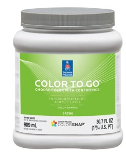
Liquid Samples Liquid Samples: Liquid paint samples are small sample jars of tinted paint to the chosen swatch. For example, Sherwin-Williams provides 1-quart "Color to Go" samples available in any of their colors in satin sheen for $12.49. This is undoubtedly the most accurate option to view color swatches in your home, although it comes at the cost of convenience.
Liquid paint samples require application—either on your walls or a poster board—which can be time consuming, messy, and potentially wasteful. Once you've chosen a color, you do have to paint over the samples which can require a lot of sanding and can sometimes involve primer. Additionally, at almost $13 for each sample, it is pricy in comparison to standard paint chips. However, liquid samples are unparalleled for providing accuracy in how the color will appear on your wall.
We recommend utilizing liquid samples towards the end of your color decision-making. If you aren't comfortable with choosing a color based on paper swatches, the only real option is a liquid sample. Waiting until you've narrowed it down can significantly reduce the cost and inconvenience of painting multiple swatches on the wall.
For our clients, we are able to make the process much smoother by ordering the swatch for them and applying and labeling it ourselves.
How to Test Paint Colors on Walls (Step by Step)
If you've chosen to utilize paper-based paint swatches—such as using paint chips or peel and stick swatches—the process for testing paint colors on your wall is fairly straightforward.
Paint Chip & Peel and Stick Color Swatch Process
Clean the Area with warm water and a drop of dish soap and let dry.
Use Wall-Safe Tape, like painters tape (if you aren't using peel and stick samples).
Stick the Sample to the Wall
Observe Your Swatch and live with it for a couple of days, noting how it looks at different times of the day and with the lights turned on and off.
If you've chosen to use a liquid-based paint sample, the process is slightly more involved, although this way achieves the best and most accurate result.
Liquid Paint Sample Color Swatch Process
Clean the Area with warm water and a drop of dish soap and let dry.
Protect Your Furniture or Floor if needed—by using tape or drop cloths—and wear clothing that you don't mind getting paint on.
Choose a Large Enough Area so you can see the color in context with the rest of the room. We recommend an area of at least 2x2 ft. If you'd like, you can block a square off with painter's tape beforehand for the cleanest result.
Apply Two Coats of paint to ensure full and complete coverage of the sample, especially if the preexisting color on the wall is drastically different from the new color you are choosing.
Normally, with interior painting, we would recommend priming before paint goes on to ensure the color is as accurate as possible. When it comes to testing color swatches, we find that simply applying 2 coats is a good middle ground for convenience and accuracy—however, if you are going from a dark paint color to a light paint color, we do recommend priming beforehand for the best results.
Consider Painting Multiple Areas for the swatch. If you have a particularly shadowy or bright area of the room, it may be worth testing the paint swatch in two or more separate places in the room to make sure you know exactly what you're getting out of the color.
Observe Your Swatch(es) for a couple of days and "live with it". Note how the color appears in natural light at different times of day and with or without artificial light.
Additionally, with liquid samples, there is a method that involves painting directly on a poster board rather than your walls. This mimics the painted texture better than paint chips and peel and stick swatches. The downside is, it does not replicate the texture of your wall, and the color may apply slightly differently to paper than to your wall. The benefits in doing this are so that you can move the sample around during different times of day, and your walls won't require any maintenance afterwards. This is a great option, especially if you are DIYing a paint job!
When and How to Observe Your Paint Color Swatches
Once you've applied your paint swatches, you'll want to live with them for 1-3 days. Note that paint takes time to dry and the color tends to darken slightly after curing. You'll want to note how each color swatch looks at different times of day, in different lighting.
Check your swatches at each time of day:
Early morning (around 8AM)
Afternoon (11AM to 2PM)
Evening (4PM to 6PM)
Late at night (after sunset, 6PM to 9PM depending on the season)
For each time of day, ensure you turn the lights on and off to best preview the color. Consider what types of lighting you use at what point in the day—for example, during the day you might use little to no lighting or exclusively overhead lights, whereas at night you may use warmer lamps more frequently or exclusively overhead lights. Imitate how you would live at home and make note of how the color appears in each instance.


For example, at home, we painted our bedroom in Cloverdale Paint's EX118 Cashew. The swatch above is taken directly from Cloverdale's website.
In the photo on the left, we have our wall in afternoon light with a bright, cool-toned artificial light turned on. In the photo on the right, we have our wall in the evening with our warm-toned lamps turned on. See how much of a difference there is, even though it's the exact same wall? They don't even look like the same color! This is the importance of ensuring you test your paint swatches properly.
Common Paint Color Swatch Mistakes to Avoid
Only Painting One Area: If the room you're painting has the walls receiving different amounts of light, it's highly advised to paint more than one swatch per room. This ensures complete accuracy in previewing how the color will look on your walls.
Judging From a Small Sample Chip: While paint chips are great for discovering colors and narrowing it down, we don't recommend utilizing them for accurately previewing colors on your walls. Paint chips are too small and lack the texture and sheen that paint does, which interferes with how they appear on your wall in comparison to actual paint.
Not Using a Pure White Sample: Pure white samples are a great way to highlight the undertones in the paint samples you've chosen. Comparing the sample against a pure white sample card can help you identify the undertones in your paint color and why it may (or may not) be working for your space.
Examples of pure white paint colors include Benjamin Moore Super White, Benjamin Moore Chantilly Lace, Sherwin-Williams Extra White, Sherwin-Williams High Reflective White, and Behr Ultra Pure White.
Painting Over a Dark Wall Without Primer: In regular painting, primer helps paint adhere to the surface and ensures complete, even coverage of the paint. We do not always recommend primer when testing paint color swatches—primarily because primer is expensive and is inconvenient for just paint swatches—but you should always prime beforehand if you are painting a dark wall from dark to light.
The primer ensures an even coverage on the wall and it gives the paint swatch a proper white base to sit on. Without primer, the color will likely appear darker, muddled or muted in comparison to what it could be with primer. If you are painting over a dark wall, you should be using primer anyways—this helps to most accurately depict how it would look on your walls after painting.
Deciding at the Store: It may be tempting to decide on a color while you're in the store, since you're already there and you can buy the paint right there on the spot. Don't fall for the trap of deciding at the store! Paint stores are retail environments with harsh, bright fluorescent lighting and do not mimic your lighting at home. Once you tint a can of paint, you usually can't return it—save yourself the headache and bring some samples home to test yourself.
Ready to Swatch Smarter?
Picking a paint color is rarely as simple as grabbing a swatch off the shelf. As you now know, everything from natural and artificial light, to the paint finish you choose, to the furniture already in the space can shift how a color ultimately looks on your walls.
The most important takeaway? Don't rush it! Bring samples home, paint them large enough to actually see, and live with them for a few days before committing. Several surveys report 60-90% of homeowners regretting their paint color choice within 2 years. The extra time spent testing colors properly is nothing compared to the cost and effort of repainting a room you're unhappy with.
If you're feeling overwhelmed by the process, that's what we're here for. As professional painters in Kitchener, we take the guesswork out of color selection—from ordering and applying your swatches to helping you identify undertones and how your specific space will affect the final result. We serve Kitchener-Waterloo, Cambridge, Guelph and surrounding areas. Contact us today for your free, no-obligation quote—we also offer color consultations!


Comments